STATE GETS FLACK OVER LOGO – ANOTHER ONE HAS SURFACED
 Creating simple is, surprisingly, not simple.
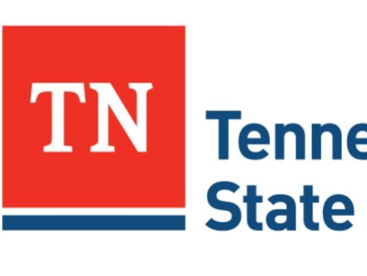
The new graphic the state of Tennessee plans to use for its departments is simple: a red box emblazoned with a white “TN” sitting atop a blue bar.
But it took Nashville-based firm GS&F nine months — and $46,000 — to develop and create the “visual identity system,” as it’s called by firm managing director Gregg Boling.
Those nine months included “all stages of information gathering, stakeholder meetings, collaborative sessions and creative development for the actual visual identity system,” Boling said. The firm entered into an agreement with the state to do the work on March 25, 2014, according to a purchasing order obtained by The Tennessean.
“For it to be successful based on all of the stated needs and objectives, it has to be simple. It’s designed to be flexible at any size, any resolution and for any application,” Boling said in an emailed statement to The Tennessean.
“This will allow it to communicate clearly across the full spectrum of Tennessee State Government agencies and to external audiences.”![]()
Meanwhile, another Tennessee firm has created a logo it says more closely represents the state. The logo depicts land and water within a modern, shiny Tennessee orange beveled frame in the shape of Tennessee. Experts who have looked at the logo indicate it has too many colors to be viable (the many different shades count as separate colors). They say logos need to be only two or three colors at the most to be cost effective to print. However, most agree the proposed “Nature” logo does have more of a look and feel of Tennessee.
")