SIMPLISTIC, NON-CREATIVE, OVERPRICED LOGO A NO GO FOR STATE
No doubt you’ve seen it by now, a “TN” inside a red box floating above a blue stripe.
And the price tag for the design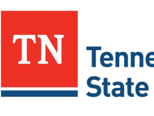 — $46,000 — and criticism that it could’ve been designed by a child.
You won’t see that new Tennessee state logo on the state flag or replacing the tristar symbol, though, said David Smith, a spokesman for Gov. Bill Haslam.
“To be clear: nothing is happening to the flag, tri-stars or state seal,” Smith said Tuesday in an email to The Tennessean.
“There is no singular graphic identity for state government currently. This (is) about a consistent graphic identity for state government. The flag and tri-stars are bigger than state government.”
Smith confirmed reports from Watchdog.org, an online news outlet, and WSMV that the logo cost $46,000 and was created by Nashville-based firm GS&F. The company submitted the lowest bid of three companies vying for the contract, Smith said.
The Tennessean submitted an open records request Tuesday to the state Department of General Services for a copy of the contract.
Gregg Boling, managing director for GS&F, shied away from calling the graphic a new state logo. In a phone interview Tuesday, he said the graphic is part of a “larger identity system” the state plans to implement.
“Basically, it’s just another design element informed by the state flag,” Boling said.
GS&F has several other prominent Nashville clients, including the Tennessee Titans, Bridgestone and LP, a building products company whose name adorns the stadium where the Titans play. The LP logo is somewhat similar to the new graphic designed by GS&F: Both are solid-color squares with two white letters above a solid-color bar.
GS&F did not design the LP logo, Boling said, adding the logo was designed before LP became a client of GS&F.
Boling and Smith did not immediately respond to questions about how much editorial control GS&F had in the design process or how long it took the agency to design the graphic.
Democrats and Republicans alike have criticized the Tennessee graphic. State Rep. Andy Holt, a Dresden Republican who’s butted heads with Haslam before, said Tuesday in a statement: “As they should be, Tennesseans are furious. While calls of negligence can be heard loud and clear atop Rocky Top in Knoxville, mockery swells like the Mississippi in Memphis.”
Last week Senate Minority Leader Lee Harris, D-Memphis, said, “Folks outside the Nashville bubble can’t understand this kind of decision-making. Maybe the administration should consider another logo design — the word ‘waste’ behind a giant ‘X.’ ”
Smith stressed the logo was not intended to be a state symbol; rather, it was designed to create some uniformity among symbols used by departments within state government.
There are at least 20 logos used by various state agencies specific to those agencies. The state Department of Economic and Community Development uses a graphic with a red “TN” that also includes a partial-guitar graphic; the symbol for the Tennessee Department of Transportation relies on the outline of the state.
Smith said the design would go live online with the state’s redesign of its websites “in the coming weeks.” The state will gradually start introducing the graphic on other mediums: When a department runs out of letterhead with the old graphic, Smith said it will receive letterhead with the new, streamlined graphic.
")